- The Weekly Scoop w/ Chronos
- Posts
- #22 - How We Do Quality Control
#22 - How We Do Quality Control
Quality control.
Such a mundane thing to do.
I mean, so what if my email has an extra full stop, or an uncapitalized letter?
It’s not like my customers are gonna care.
Well, there’s the little things like those, and the bigger things that might impact an entire campaign, open rates, click rates, place order rates.etc.
Let me walk you through it in today’s newsletter.
1) Drafted Campaign Coincides w/ Master Plan
I’m sure you do so for your brand already, but we plan out our brand’s campaigns 1 - 2 months in advance (example below).
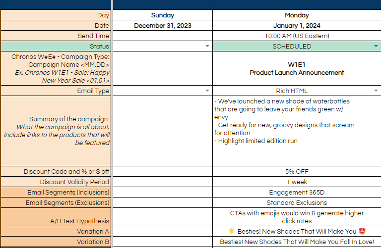
In freak incidents, the wrong subject/preview line can be inserted into the wrong campaign, which would be a massive problem.
Also, since content changes from phase to phase, what might be valid on the first draft might not be valid on the final, so we’re looking out for that as well.
That’s why upon scheduling, there’s always a cross reference against the campaign, and our master spreadsheet for the brand.
2) Email Settings
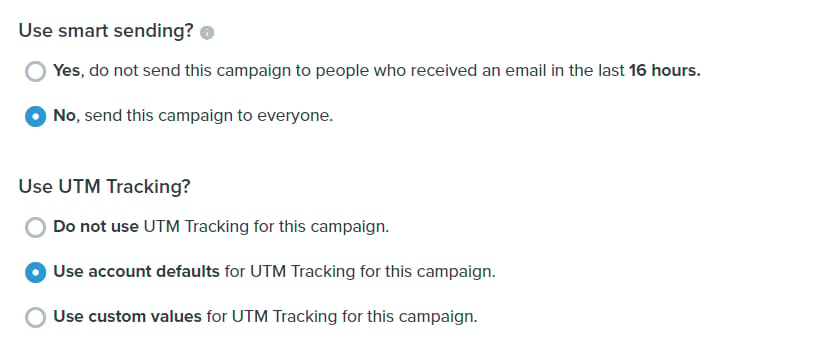
We turn smart sending off to make sure that everyone who’s supposed to get the emails will get it (otherwise they’re filtered out by exclusions).
UTM’s pretty standard.
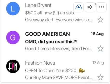
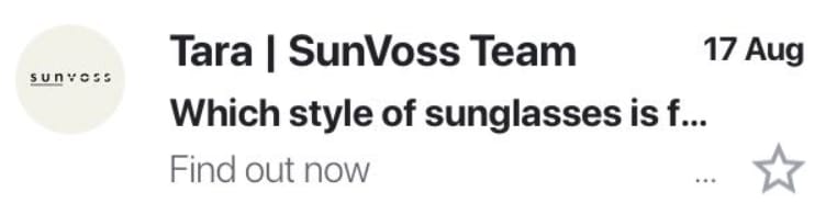
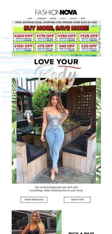
3) How Do Your SL/PLs Look In the Inbox
It’s a minefield in your customers’ inbox.
150 different brands screaming for attention, with 200 more with a discount ‘eNdInG nOw’ (we absolutely do the same though 😂).
That’s why your subject and preview lines have to pack a punch, in order to get that initial open.
As our Father of Advertising says:
“On average, five times as many people read the headline as read the body copy. When you’ve written your headline, you’ve spent eighty cents out of your dollar.”
So treat your subject and preview lines as your initial headline.
Here are ones that are decent:
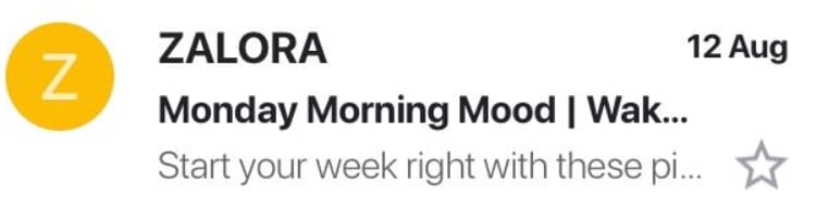
And the not so good ones:
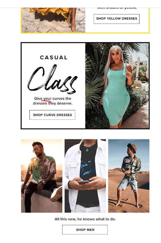
4) All Things Copy
Definitely not something that can be picked up within a day, but here’s one book you should definitely go through - Breakthrough Advertising by Eugene Schwartz.
Good copy tends to have magnetic headlines.
Headlines that make you go:
“Woah, wait a sec”
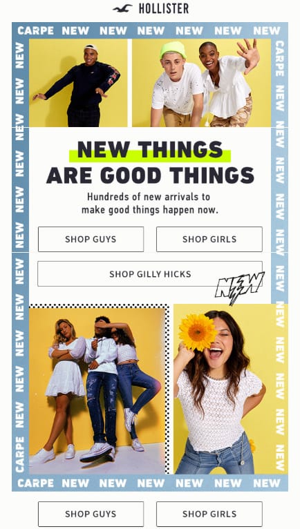
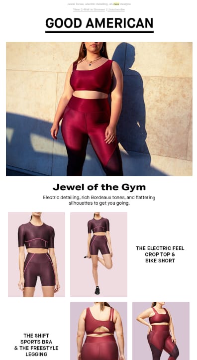
Next up, consumable copy.
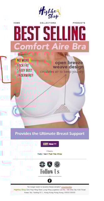
What’s the likelihood my customer will read the block of text, versus scanning what’s on the image?
For us personally, we skipped the chunk of text for the image below.
Flatter your customers
This is a gross oversimplification, but using words like ‘you’/’your’ in your copy helps your customers feel heard, and puts them in the ‘shoes’ of the model/situation.
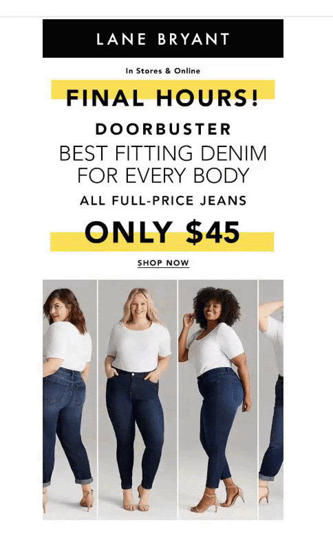
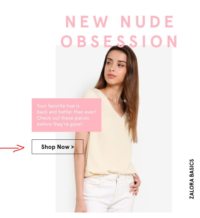
Having a clear CTA button
Goes without saying, but you really have to handhold your customers.
Without these, you might as well be just ‘another interesting’ email in their inbox, versus something ‘I need to buy now’.
Take a look at the examples below, which would you say gives me a clear message on what to do next? (we kinda gave it away haha)
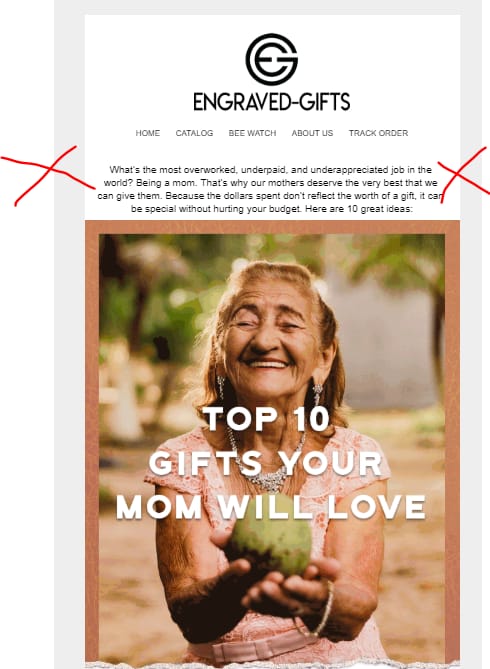
Benefits > Features
Nobody cares your new product has state of the art fabric.
They care that this fabric is super cool to the touch, and leaves them feeling cool in the hot sun.
Here’s an example:
And that’s a wrap!
Got about 5 more points I can run you thru, but wanna make the content digestible, so I’ll stop here, and carry on next week.
As always, feel free to send any questions our way.
And have a great weekend.

Joshua Foo